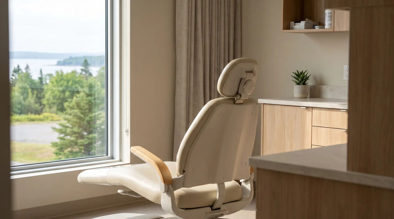
Good dental website design helps a patient book in under a minute on a phone. That takes a clear new patient page, an emergency page, one page per service and per location, online booking, real photos of your clinic and team, and copy that follows your provincial regulator's advertising rules, which in Ontario rule out testimonials and claims of superiority.
A patient with a cracked tooth on a Saturday morning and a family that has just moved to town want different things from your website. The first needs your phone number, hours and directions immediately. The second wants to compare clinics, check whether you direct bill their insurance and see who will be treating them. A site built around a homepage and a generic list of services can easily serve neither.
Canada adds its own considerations. Each province regulates how dentists advertise, which affects what your service pages, team bios and review widgets can say. Whether you accept the Canadian Dental Care Plan is also something your website should answer before a patient has to call and ask.
This guide approaches website design for a dental practice from both ends. It works backwards from the two journeys patients make, urgent and planned, and forwards from your regulator's rules, so page structure, booking flow and copy are settled before anyone picks colours. It covers the pages to build, how online booking should work, Ontario's advertising guidelines as a worked example, privacy, accessibility, multi-location structure and what to measure each month.
Patients arrive with one of two jobs: get help today, or choose a clinic they will stay with. Each job needs its own page, because the details that settle an urgent visit are not the details that win a planned one.
A person searching "emergency dentist" or "toothache near me" is in pain and wants to act. They need today's hours, a tap-to-call phone number, directions and a plain statement of whether you see same-day emergencies. A welcome video and a mission statement only slow them down.
A dedicated emergency page puts those four things at the top. It also gives search engines a page that matches the search, instead of sending the patient to a homepage and hoping they find the phone number.
Searches such as "new patient dentist" plus a town name, cleanings, clear aligners, implants or family dentistry come from people who are comparing clinics. They read the new patient page, check insurance and direct billing, look at the team and decide whether the clinic feels calm and competent. They are choosing a relationship, so they read before they book.
Before anyone sketches a layout, sort every planned page into urgent or planned. Urgent pages stay short, with the phone number, hours and map first. Planned pages can go deeper, but every one should end with a clear Book button. A page that serves neither journey probably does not need to exist.
A dental clinic website needs six page types: new patients, emergency, one page per service, team, one page per location, and insurance and payment. Build these first, then add a blog or gallery once the core pages are solid.
The federal guidance also notes that providers confirm a patient's plan eligibility through their existing intake process. Add a plan question to your new patient form so the front desk does not have to chase the answer by phone.
Yes, as long as it shows real availability and works smoothly on a phone. Patients who look you up outside office hours, or who would rather not call, need a way to commit while they are still on your site.
Urgent patients still call, and those calls ring out while staff check patients in or settle a bill. When the front desk is busy, an AI receptionist can answer the call, book the appointment and send reminders; we build these for busy front desks, and our post on virtual receptionist services for dental clinics and law firms explains how they work.

Dental advertising is regulated province by province, and your website counts as advertising. Settle what your pages may say before design starts, because the rules change the review widget, the service copy and the team page.
The Royal College of Dental Surgeons of Ontario's advertising guidelines define professional advertising as any material related to a dental practice that is published, displayed, distributed or used, whether by the office or by someone on its behalf. They also ask dentists to personally control all printed and electronic material about their practice, so a dentist signs off on every page, not just the agency. Among other things, the guidelines do not allow:
| Common website element | What to do in Ontario |
|---|---|
| Reviews or testimonials widget | Think twice before adding one; testimonials are not allowed |
| "Best", "painless", "state of the art" | Remove them and describe the treatment instead |
| Service pages promising results | Explain what the treatment involves without promising outcomes |
| Free whitening or a contest for new patients | Drop it; giveaways and free services count as incentives |
| Team bios listing courses and memberships | Keep to the degrees required for registration |
| Dentist titles | Label general dentists and specialists accurately |
Confirm the College's current requirements on specialist titles and patient photos in the full practice advisory before launch.
These are Ontario's rules only. If your clinic is in another province, read your own provincial dental regulator's advertising rules, including any rules on reviews and patient photos, before writing copy. We design and build websites from Saint John for regulated professions where advertising rules shape what a site can say, including law firms subject to Law Society rules, and our web design services build the regulator's guidance into the brief.
Federal and provincial privacy laws apply to patient information, and website forms are where that information first arrives. Keep the contact or request form to name, phone, email, preferred location and a short reason for the visit. Never collect health history, medications or insurance details through a plain email form; route them through a secure form or your practice software's intake instead. Under every form, say in plain words what you collect, why and who sees it, and link to your privacy policy.
Readable text, strong contrast, real photos and light pages serve every patient, including older adults and people with disabilities. In Ontario, accessibility is also a legal duty for organizations of a certain size.
As of January 1, 2021, Ontario's AODA requires businesses and non-profit organizations with 50 or more employees to make their public websites accessible, according to the Government of Ontario's guidance. Public web content posted after January 1, 2012 must meet WCAG 2.0 Level AA, with exceptions for live captions and pre-recorded audio descriptions, and the organization that controls the site, directly or through a contract, is responsible. Count every employee in the organization, hygienists and assistants included, when you check the threshold. This requirement is Ontario's, so do not assume it describes the rules in other provinces.
Design and test on a phone first. Compress and resize images, and keep scripts light by removing chat widgets, sliders and trackers nobody uses. Then book a test appointment on a real phone over mobile data and time it against the under-a-minute goal.

Run one website with a dedicated page for each clinic. Each location page should match that location's own Google Business Profile, with identical name, address and phone number.
Google's guidelines for Business Profiles ask businesses to represent themselves the way they are consistently represented in the real world, across signage, stationery and other branding, and to keep the address accurate and precise. The same guidelines warn that duplicate profiles for one business cause problems with how information displays on Maps and Search. In practice, the clinic name on the sign, the profile and the location page should read the same.
Each location page needs:
Link each profile's website field to its location page, not the homepage, so a patient who taps through lands on the right address. On the technical side, location pages can carry Dentist structured data for that clinic, while service pages use the Service type with the clinic referenced as the provider.
Separate websites for each location split your content, links and upkeep across several domains, so keep the group under one domain. Our guide to local SEO for dentists covers the profile and listing work that sits alongside the website.
Track new patient bookings, calls and form completions every month, broken down by where they came from. A redesign that looks good but does not move those measures has not done its job.
| Metric | Where to find it | What to look for each month |
|---|---|---|
| New patient bookings by source | Booking system and website analytics | Which channels (search, Business Profile, ads, referrals) bring first visits |
| Calls from the website | Call tracking number or tap-to-call events | The trend over time, and how many calls went unanswered |
| Calls from the Business Profile | Your Business Profile performance report | Which locations get calls, and at what times |
| Booking form completions | Analytics conversion events | Starts versus completions, and the step where patients drop off |
| Emergency calls | Tracking number on the emergency page and the front desk log | Daytime versus after-hours calls, and how many were booked same day |
Review the table on the same day each month with the practice manager. If plenty of patients start the booking form but few finish it, shorten the flow. If emergency calls arrive after hours and go unanswered, fix the after-hours instructions or call handling before spending money on ads.
Most of the work in good dental website design happens before anyone chooses colours. Start from the two journeys patients make, urgent and planned, and give each its own pages: emergency, new patients, one per service, team, one per location, and insurance and payment. Make booking work on a phone in a few steps, with a fallback request form and instant confirmations. Then write every page to your provincial regulator's advertising rules, keep health details out of plain email forms, build for accessibility and match each location page to its Business Profile. Check bookings and calls every month so you can see whether the new site is doing its job. If you are planning a new build or a dental practice website redesign, book a free consultation with our team in Saint John.