Most early-stage founders treat branding like a luxury. Something to figure out after product-market fit. After the first funding round. After the chaos settles.
That instinct is understandable. But it costs you more than you think.
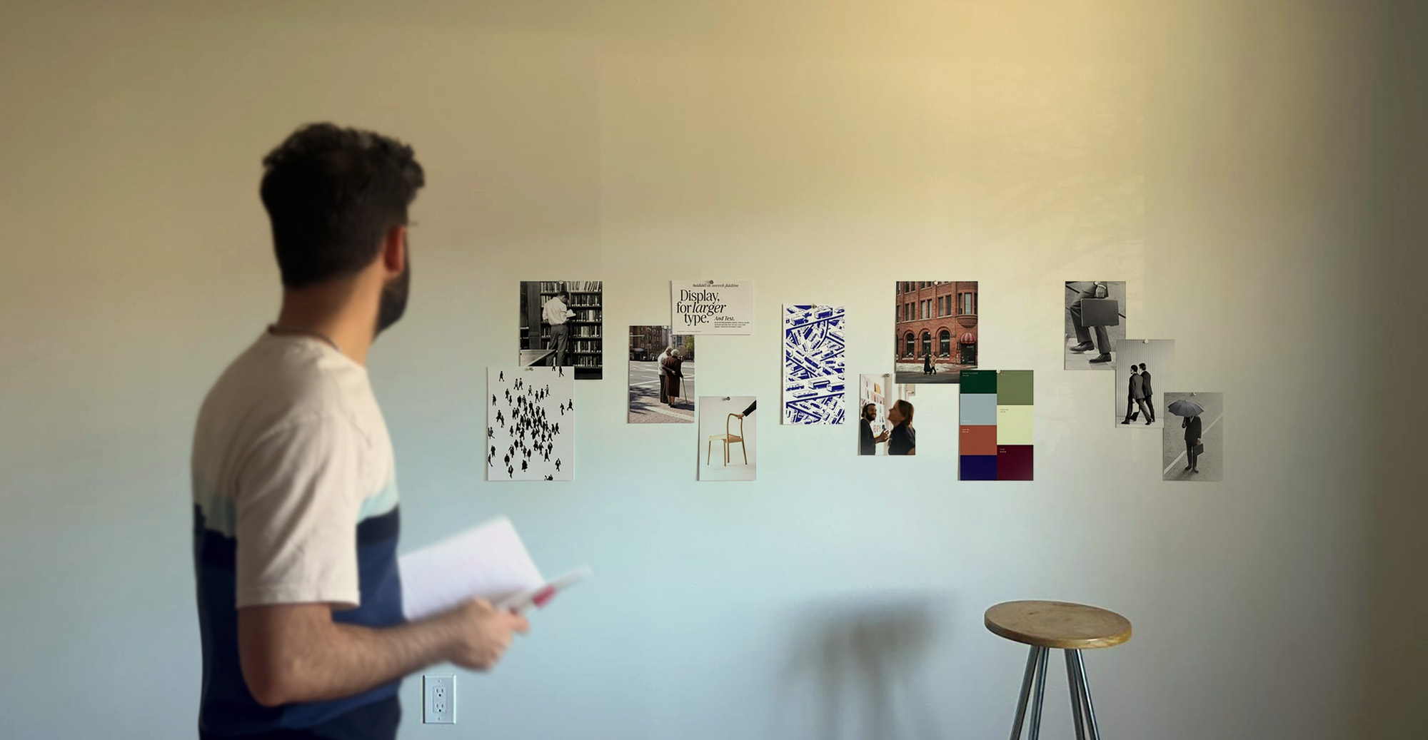
In 2026, your brand is often the first thing a potential customer, investor, or partner interacts with before they ever speak to you. Your Instagram profile, your landing page, your pitch deck thumbnail. These surfaces make a judgment call in under three seconds. And if your visual identity looks inconsistent, amateur, or generic, the story it tells is: this team is not ready.
The good news? You do not need a $20,000 branding agency to fix this. Working with early-stage startups across sectors from SaaS to consumer goods, we have seen founders build genuinely strong brand identities for under $500 when they understood the process. The tools are better than ever. The frameworks are accessible. What is missing for most founders is not money. It is a clear sequence of decisions.
This post covers exactly that sequence. We will walk you through how to define your brand positioning before you design anything, what a minimum viable identity actually includes, which tools deliver professional results on a real startup budget, and how to avoid the most expensive mistakes we see founders make repeatedly with branding.
Whether you are pre-launch or six months in and realizing your current brand is not working, this guide gives you a practical, tested path forward.
Brand identity for startups is not your logo. That is the single most common misconception we encounter, and it leads founders to spend money in completely the wrong place.
Your brand identity is the full system of signals that communicates who you are, what you stand for, and who you serve. It includes your visual language, yes. But it also includes your tone of voice, the vocabulary you use in product copy, how you write an error message, and the feeling someone gets when they land on your homepage for the first time.
Logo-first thinking is the root of most startup brand failures. A founder hires a freelancer on Fiverr for a $30 logo, drops it on a template website, and calls the brand done. Six months later, the visual identity is inconsistent across channels, the messaging is unclear, and they are back to square one after burning time and credibility.
The right starting point is always positioning. Before you pick a font or a color, you need to answer three questions with real specificity. Who is your customer, not in demographic terms but in terms of their worldview and what they care about? What do you do differently than everyone else in your category? And what feeling do you want someone to have after their first interaction with your brand?
I have sat in brand kick-off sessions with founders who could not answer those three questions. When that happens, any visual identity we create is just decoration. It has no strategic spine. And decoration does not build trust or drive conversion.
The founders who get the most out of a limited branding budget are the ones who do the positioning work first. They come to the design process with clarity, not just a vibe board.
At DigiBenders, we have seen that even a two-hour positioning workshop before any visual work begins cuts revision cycles by roughly 60 percent. That translates directly into cost savings and faster go-to-market timelines.
A minimum viable brand identity has six components. Not twenty. Not a full brand guidelines document that takes three months to produce. Six things, done well, will carry you through your first year.
First is your brand name and tagline. The name should be distinct, easy to spell, and available as a domain. The tagline should communicate your core value proposition in under eight words. This is harder than it sounds, but it is worth the effort.
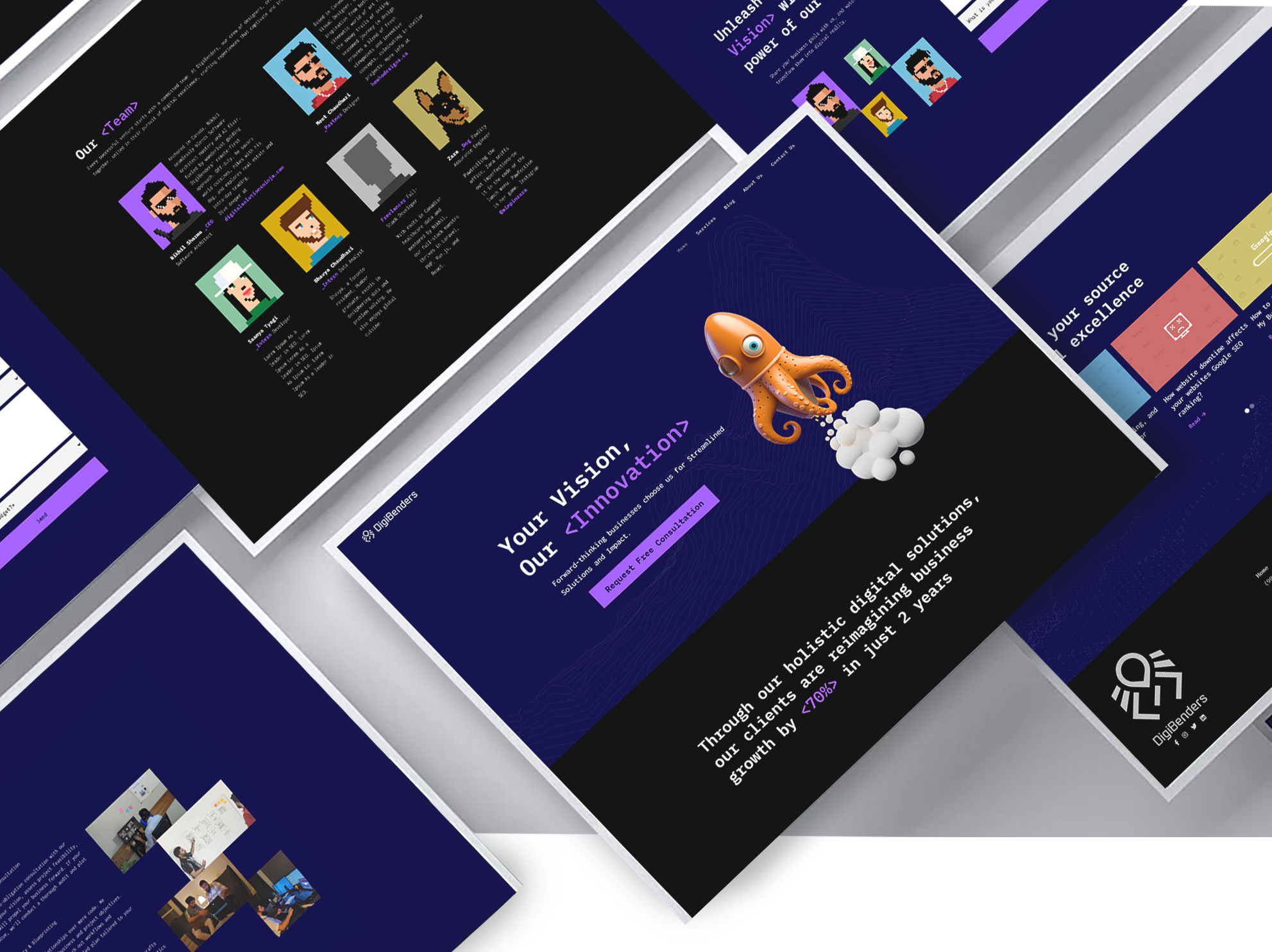
Second is your logo system. This means a primary logo, a simplified icon or monogram version for small applications like favicons and app icons, and a horizontal lockup for letterheads and email signatures. You do not need more than that at this stage.
Third is your color palette. Two to three colors maximum. One primary, one secondary, one neutral. In 2026, accessible color contrast is not optional. Run every combination through the WebAIM Contrast Checker before finalizing.
Fourth is your typography. Two typefaces: one for headings, one for body copy. Google Fonts gives you access to high-quality, free options that are used by serious brands. Inter, Plus Jakarta Sans, and DM Sans are three we recommend regularly. Pair one of those with a slightly more distinctive display font and you are set.
Fifth is your brand voice guide. This does not have to be long. A single page that covers your three core personality traits, five words you always use, and five words you never use is enough to create real consistency across a small team.
Sixth is a set of core templates. A pitch deck template, a social media post template, and an email header. These are the surfaces you will use most in your first year, and having them designed in your brand system prevents the slow drift into visual inconsistency that kills early-stage brand credibility.
Building all six of these well is realistic on a budget of $500 if you use the right tools and invest time where it matters.
Here is what a realistic startup branding budget looks like in 2026, broken down by category and tool.
Logo design is where most founders either overspend or underspend. At the high end, a senior freelance brand designer charges $1,500 to $5,000 for a logo system or identity. That is worth it eventually, but not at pre-revenue stage. At the low end, AI logo tools like Looka or Brandmark can generate a workable starting point for $65 to $100. The output will not be bespoke, but it will be clean, vectorized, and functional.
If your budget allows a middle path, posting a well-briefed project on Contra or Dribbble Hiring with a $200 to $300 budget will attract emerging designers who produce genuinely strong work. The brief is the key. A specific, detailed brief produces better results than a generous budget paired with a vague one.
For your full visual identity design, Figma's free plan is the most capable free design tool available right now. With community templates specifically built for brand style guides, you can assemble a professional-looking brand document without purchasing software.
Canva Pro, at $15 per month, is worth every dollar for the template consistency alone. The brand kit feature lets you lock in your colors, fonts, and logo so every piece of content your team produces starts from the right foundation. This single tool prevents more brand drift than anything else at this stage.
For fonts, Google Fonts is free and comprehensive. For stock photography and illustration, Unsplash and Pexels cover photography at no cost. For icons, Phosphor Icons offers a cohesive, modern icon library with a generous free tier.
A practical budget allocation for a complete minimum viable brand identity:
Logo design via freelance brief: $200 to $300. Canva Pro for three months: $45. Domain and social handle audit: free with Namecheap search. Brand voice and positioning workshop using a framework like the Brand Archetypes model: free, with your own time. Total: $245 to $345, with room to spare.
Spend the remaining budget on a single professional brand review session with a consultant. One hour of expert feedback before you finalize everything is one of the highest-ROI investments a founder can make at this stage.
The most expensive branding mistake is not spending too little. It is spending without a strategy and then having to redo the work eighteen months later when you are trying to raise a round or close an enterprise deal.
Mistake one is designing for yourself instead of your customer. Founders almost always have strong aesthetic preferences. That is fine. But your brand exists to create recognition and trust with your target buyer, not to express your personal taste. If your customer is a risk-averse procurement manager at a mid-sized company, a brand that looks like a DTC streetwear label is working against you, regardless of how good it looks.
Mistake two is treating brand consistency as optional. Inconsistency is a credibility killer. If your logo appears in three different colors across your website, pitch deck, and social media, it signals disorder. Customers and investors read visual inconsistency as organizational inconsistency. Using a brand kit tool like Canva Pro or Figma libraries eliminates this with almost no extra effort.
Mistake three is copying category conventions too closely. If every competitor in your space uses blue and sans-serif fonts, you will disappear into the background by doing the same. A small amount of intentional differentiation in your visual identity creates disproportionate recall. When we worked with a B2B fintech client at DigiBenders who was using the standard blue-and-gray palette common in their category, switching to a warm off-white and forest green palette made them instantly more memorable at trade shows and in demo follow-up emails.
Mistake four is writing brand copy that is generic. Phrases like "We help businesses grow" or "Solutions for the modern enterprise" tell a potential customer nothing. Every word on your homepage is a branding decision. Vague copy signals a brand that has not done the positioning work.
Mistake five is waiting until everything is perfect to launch. Your brand will evolve. The goal at this stage is clarity and consistency, not perfection. Ship the brand, then iterate based on real customer feedback.

DIY branding gets you started. It does not get you funded, enterprise-ready, or category-defining. Knowing when to bring in professional help is one of the most strategic decisions a founder makes.
The signals that it is time to invest in professional brand work are specific. You are approaching a Series A pitch and your current brand does not communicate the scale of ambition in your deck. Your sales team is hearing feedback that the product is great but the company does not look established enough. You are entering a new market segment where your current brand positioning does not land. Or you are hiring quickly and need a brand strong enough to attract talent who have other options.
At any of those inflection points, the ROI calculation on professional brand investment shifts dramatically. A rebrand that costs $8,000 to $15,000 from a studio like DigiBenders is a rounding error compared to the cost of a failed fundraise or a lost enterprise deal because your brand did not signal credibility.
When you do hire professionally, the brief you bring to the engagement determines the quality of the outcome more than the budget does. Come with your positioning answers, your target customer research, a competitive visual audit of your category, and clear examples of brands you admire and why. The better your brief, the faster the process moves and the better the result.
For early-stage founders who are not yet at that inflection point, a hybrid approach works well. Use DIY tools to build your version one identity. Hire a professional for a focused audit and refinement session, not a full rebrand. Many senior brand designers offer three to five hour brand audit sessions for $300 to $600. That investment can add significant professional polish to a self-built identity without the cost of a full engagement.
The goal is to build something credible enough to get you to the next stage, then invest in the professional work that will carry you through the stage after that. Brand investment should scale with your business, not sprint ahead of it or lag behind it.
Building a startup brand on a budget is not about cutting corners. It is about spending in the right sequence. Define your positioning first. Build your minimum viable identity second. Use the right tools to maintain consistency from day one. And know exactly which signals tell you it is time to bring in professional help.
The founders who build durable brands early, even on tight budgets, are the ones who treated brand identity as a strategic decision rather than a design task. They asked the hard questions about who they serve and what makes them different before they ever opened a design tool.
Your brand is working for you or against you right now, whether you have invested in it or not. The question is which one.
If you are ready to build something that actually reflects the quality of what you are building, start with your positioning. Everything else follows from there. Lets talk if you're ready.