CLG Injury Law has been serving Atlantic Canadians since 1987. The challenge was not to make them look new. It was to make them look like they had always been this good.
A personal injury law firm with that kind of legacy carries weight. CLG operates from six offices across Atlantic Canada. Halifax, Moncton, Saint John, Fredericton, Charlottetown, and Truro. Each market is distinct. Each client base has its own expectations. The identity had to work in all of them without losing coherence.
Their clients are not looking for the loudest firm. They are looking for one that knows what it is doing and will actually pick up the phone. That insight shaped every part of the rebrand.
Most law firm rebrands fail because the agency walks in with a vision before understanding the firm.
The partners at CLG already had the right instinct for the logo. Three waves, because Atlantic Canada is defined by the ocean and the firm wanted to feel local to the people it serves. Our job was not to override that idea. Our job was to refine it and build a full identity system around it.
This is the part most design agencies skip. Listening properly. Taking the seed of the client's own idea seriously. Developing it instead of replacing it. If you are a partner looking for agency for a rebrand, look for one that asks more questions than it answers in the first meeting. The ones that show up with a finished concept are usually selling, not listening.
The brand had to work at the regional level and the local level at the same time. A client in Halifax and a client in Charlottetown both had to feel that CLG belongs to their province. So did every client in Moncton, Saint John, Fredericton, and Truro.
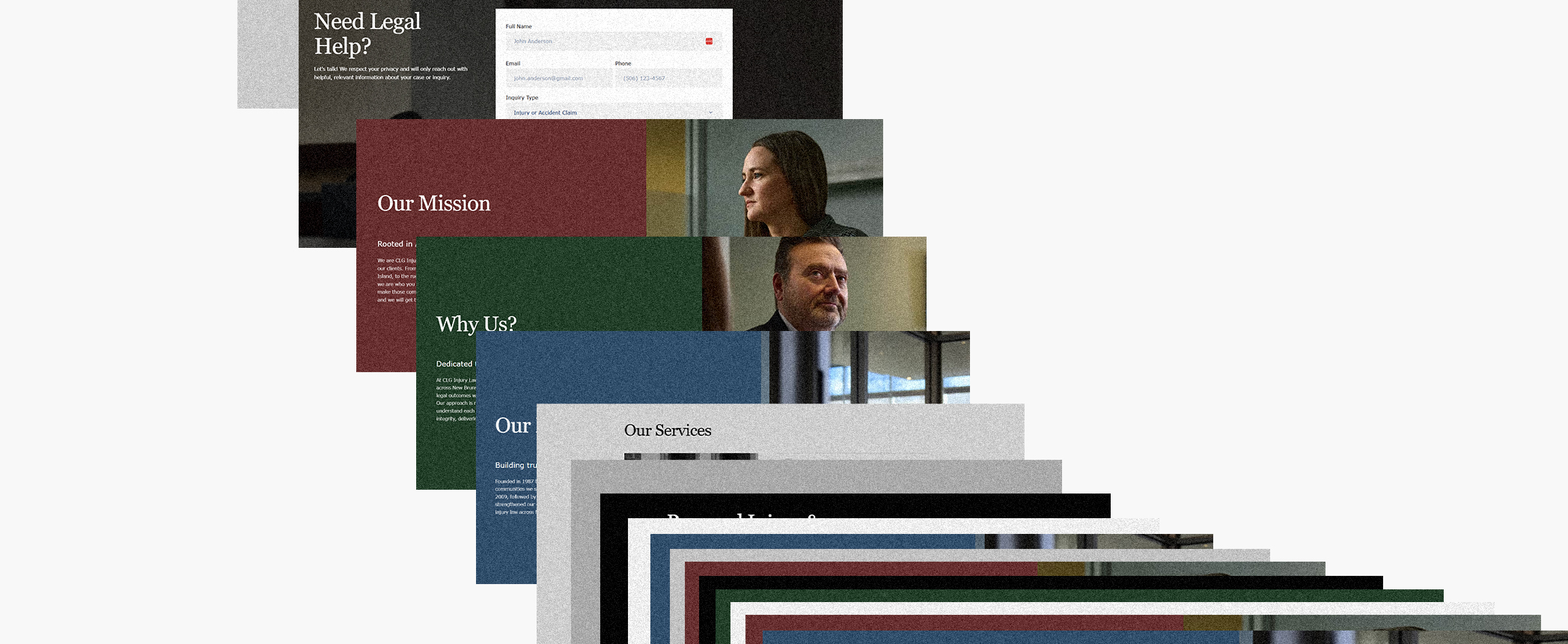
We solved it with a three-colour system tied directly to the three provinces. Red for Prince Edward Island. Green for New Brunswick. Blue for Nova Scotia. These were not decorative choices. They became architecture.
On the website, each lawyer's profile page shifts to reflect the province where they primarily practice. A client in Moncton sees green. A client in Halifax sees blue. A client in Charlottetown sees red. The same logic applies for Saint John, Fredericton, and Truro. Service pages carry custom illustrations in the same palette. Social media uses the three colours in consistent ratio so no single province ever feels secondary.
Outside of the provincial indicators, the palette stays in shades of grey, white, and black. Clean and authoritative. The colour system carries through everything but never competes with the content. That balance is what makes a multi-colour brand identity work instead of feeling chaotic.
Modernizing a 38-year-old law firm brand is not about discarding what came before. It is about translating it.
The logo refresh kept the three-wave concept but tightened the geometry and rebuilt the mark to work at every size, from a Google Business Profile thumbnail to a building sign. The wordmark sits in a refined serif that signals institution and longevity.
On the website, body typography uses the same serif family. It carries the weight of a long-standing firm while staying readable and unfussy. On social, where space is tight and the format demands speed, a condensed sans takes over. The identity supports each format rather than fighting it. That is the difference between a brand that travels cleanly across channels and one that breaks the moment it leaves the website.
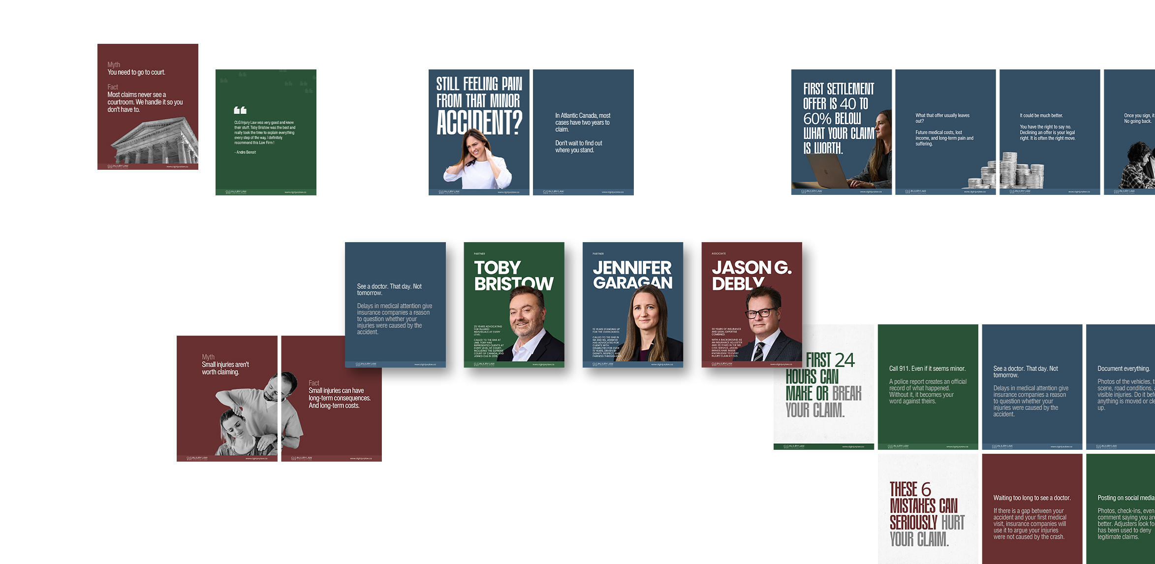
The same system carries through to CLG's social media presence. We built the social identity alongside the website so the firm presents consistently whether a client lands on the homepage or a Facebook post.
The website had to feel classic. Not old. Classic.
We built it in Webflow with a multi-page structure covering three provinces, six office locations, and every practice area CLG handles. Motor vehicle accidents. Serious injuries. Long-term disability. Insurance disputes. Each location and practice area has its own dedicated page, which strengthens regional SEO and gives every market a real digital presence.

The layout is modern but the feel is institutional. Generous white space. Clear hierarchy. Type set at sizes that respect the reader. Every element has room to breathe. Premium does not come from decoration. It comes from restraint. That is one of the most overlooked principles in law firm website design.
Mobile responsiveness, page speed, and search visibility were treated as non-negotiable. A person searching for an injury lawyer at 11 PM on their phone is not in a patient mood. The site loads fast and gets out of its own way.
A law firm brand is only as strong as the imagery that carries it. We gave CLG clear direction. References. Lighting notes. Tone notes. Specific guidance on how the partners and lawyers should be photographed, where, and why.
CLG took the direction seriously. They hired a strong photography team and delivered a library of images that feel like the firm. Grounded. Local. Human. Every image was then edited and placed with intention. Sized to its layout. Cropped to its space. No padding, no stretching, no filler stock.
For any law firm partner planning a rebrand, do not treat photography as the last item on the list. It is the most visible part of the brand the moment the site goes live.
The system was designed to communicate authority and substance before a single word is read. Logo. Colour. Type. Layout. Photography. Spacing. Every element pointing at the same idea. This is a firm that knows what it is doing.
That is the bar for any law firm rebrand worth doing. If a stranger lands on the homepage and immediately senses these are serious people, the brand is working. Everything else follows from that.
CLG Injury Law had 38 years of legacy when we started. The work was to make that legacy visible in a way today's clients can recognize. Start from what is already true about your firm. Then bring in the design discipline to express it in a way the next generation of clients will respond to.
Most of the law firm partners we work with come to us through referral or after searching for a branding agency for law firms in Atlantic Canada. The ones who move fastest are partners who already sense their current brand is holding them back. They are not looking for a vanity refresh. They are looking for a system that will carry the firm for the next decade.
If you are a law firm partner in Halifax, Moncton, Saint John, Fredericton, Charlottetown, Truro, or anywhere else in Atlantic Canada, the starting point is the same. What is already true about your firm? Build from that.
See the full scope of the project in the CLG case study.
Book a free discovery call if you want to talk through what a rebrand could look like for your firm.